Graham Letorney
LinkedIn Design Exercise
February 2020Introduction
LinkedIn enables professionals to be more productive and successful by helping them stay informed and build meaningful relationships. A productive content ecosystem relies on a healthy balance of content contributors and consumers that share and learn knowledge about their industries, careers and professional interests. For many members, however, it feels scary or risky to contribute to the platform since their actions are tied to their professional identities.
Task
Design an experience that helps novice contributors overcome the barriers to sharing.
Problem Definition
For many members, it feels scary or risky to contribute to the platform since their actions are tied to their professional identities.Ideation & Research Setup
Goal: Frame the problem- Experience the LinkedIn publishing tool for myself (be a user)
- Better understand other user's values & motivations
- Better understand other user's risks & detractors
To get started:
I wanted to see the problem for myself. Personally, I had not published a real article until now and had never felt the nervousness of pressing the publish button!
Takeaways:
This gave me a good sense for how uncertain a user could be. To be honest, I read the short article more than 20 times before I had the courage to press the blue publish button. After publishing, I made 5 updates once I saw it live.
Hot questions:
- Exactly what happens the first time I click the blue button?
- Answered after first experience, but it provided a bit of anxiety.
- Exactly who sees the article?
- Does LinkedIn curate favorites to share with a larger audience? Will my article be considered?
Define my own values & motivations as a user:
- I value concise, thoughtful insight about my area of work (UX Design).
- I value advice that is practical and relevant.
- I appreciate a good metaphor.
- Deep down, I want to be considered a thought leader - or at least a thoughtful leader :)
- I hope to assist / inspire / motivate my peers and the next generation of designers.


User Research
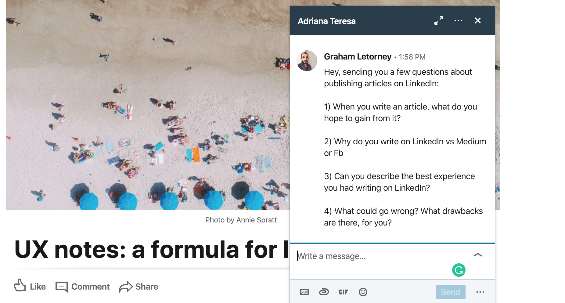
To get more data points on the problem from other users, I sent the same set of 4 questions to three friends who I know have published articles. As none of them are 'power users' this seemed like a good starting points for this exercise.**In a production environment, I would do a significantly more thorough selection process to get feedback from the right voices.
Questions:
1) When you write an article, what do you hope to gain from it?
2) Why do you write on LinkedIn vs Medium or Fb
3) Can you describe the best experience you had writing on LinkedIn?
4) What could go wrong? What drawbacks are there, for you?
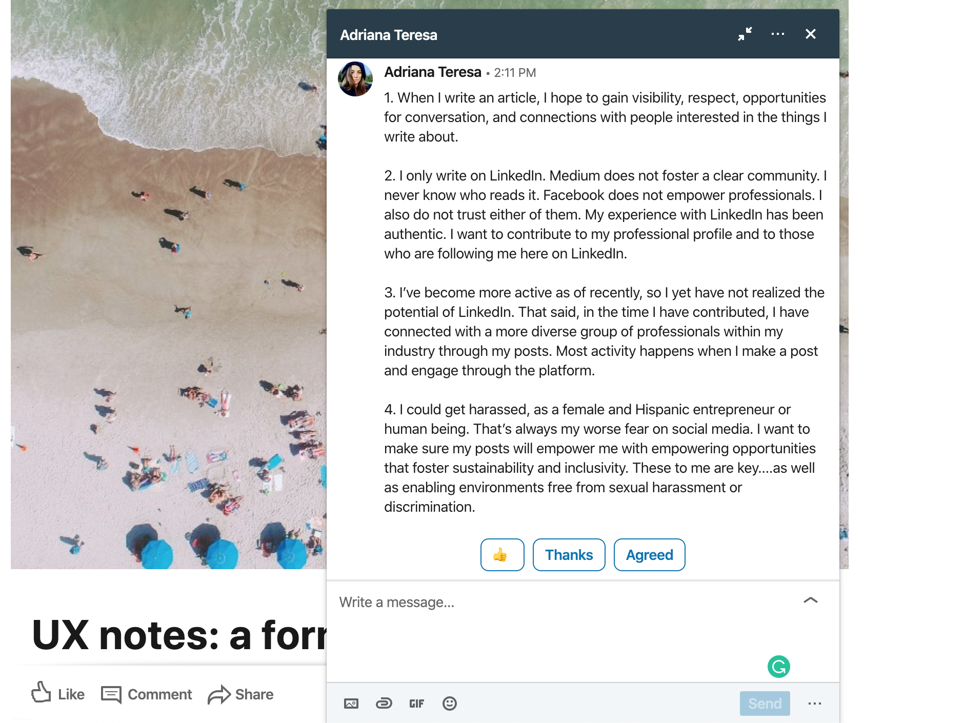
I could get harassed, as a female and Hispanic entrepreneur or human being.
That’s always my worse fear on social media.
That’s always my worse fear on social media.
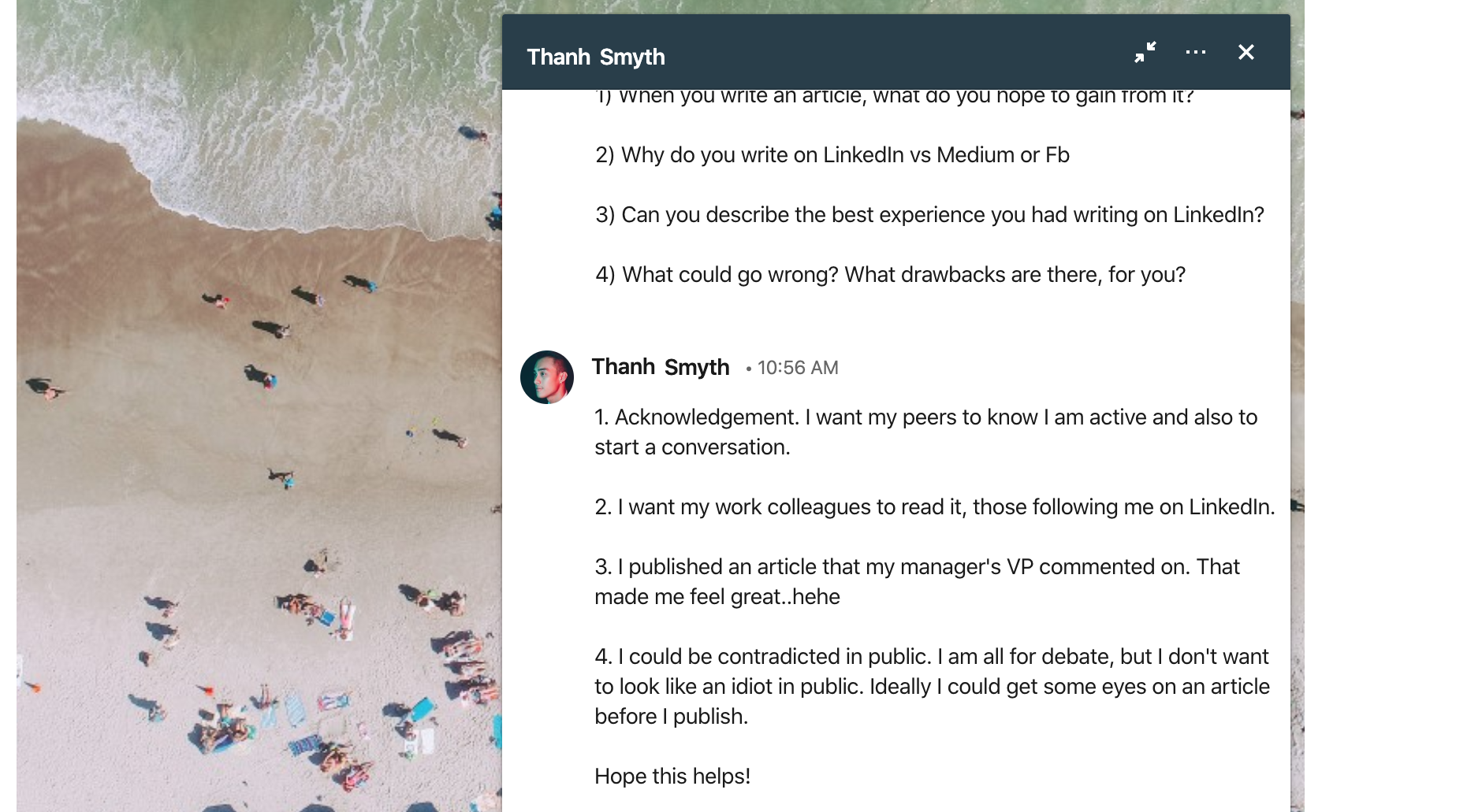
I could be contradicted in public ... Ideally I could get some eyes on an article before I publish.

My worst fear is 'stupid mistakes' - and you are always putting yourself out there
... [on LinkedIn] your people are watching
... [on LinkedIn] your people are watching
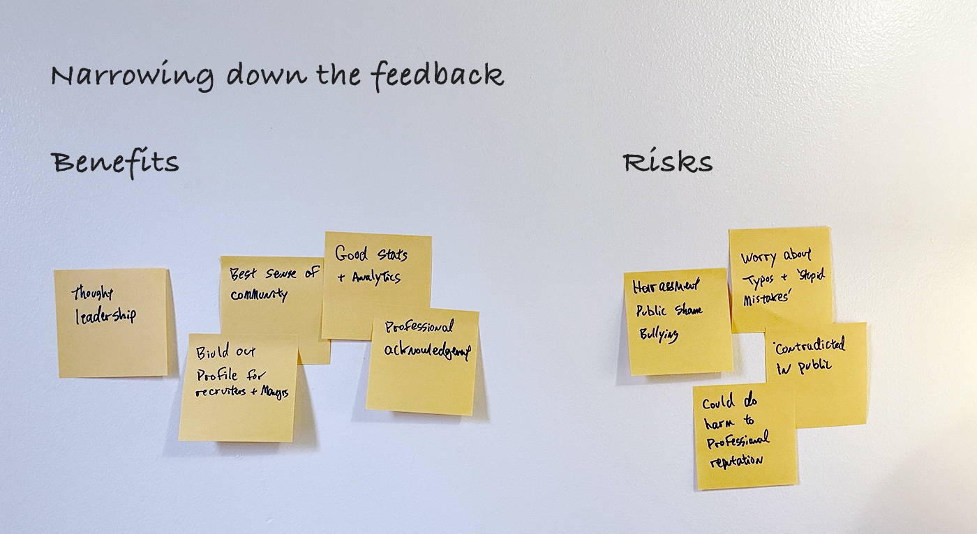
| Benefits - Thought leadership - Professional acknowledgement is meaningful to career - Best sense of (professional) community - Build out profile for recruiters and managers - Good stats and analytics (Ln) | Risk - Article quality - typos and technical writing concerns - Worried about negative feedback - Public harassment / negative comments - High bar for good content, mediocre results can do harm to reputation |
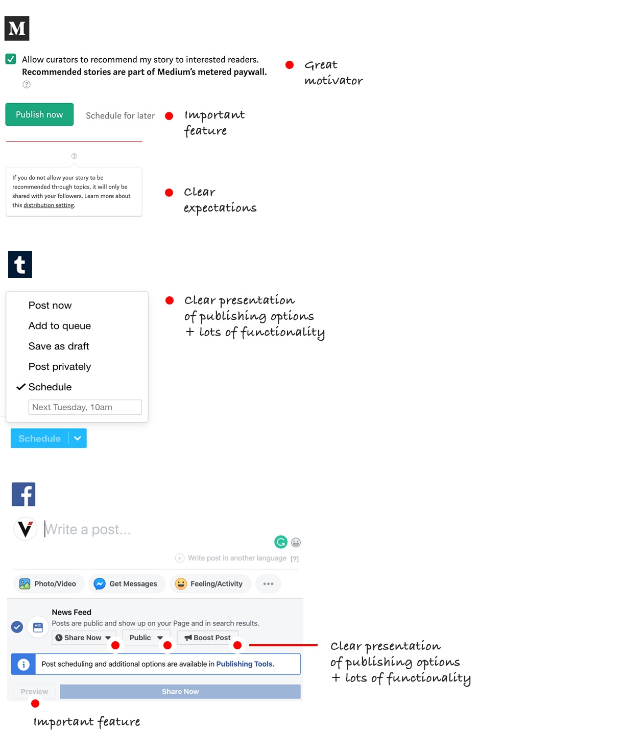
Competitive analysis
After analyzing the feedback and taking into account my own experience, at at this stage I became focused on two specific points of the publishing flow:
1. The Empty State
2. The Publish Button


Hypothesis to reduce the risk inherent
in the publishing process
Hypothese:
If we provide more context to the user around publishing on LinkedIn and consider expanding the range of publishing options, we will empower novice contributors with more confidence and security to publish more.
To accomplish this I recommend focusing on the two critical moments noted above: empty state and the publishing modal.
To be clear, this is a cursory review for this exercise. That said, with the information collected so far, I have assembled the following summary:
• Empty State
- Brief tooltip to empower user with control over the publish button.
- Be more explicit about the current privacy state of Draft.
- Give more attention to the different types of media, less focus on text formatting.
• Publishing modal: provide more publishing options
- Publish (current options)
- Give more attention to the different types of media, less focus on text formatting.
• Publishing modal: provide more publishing options
- Publish (current options)
- Publish quietly (skips feed, profile only)
- Schedule for later
Design Principles
The current article tool is wonderfully simple and elegant. The job at hand is to layer in the aforementioned updates with a very light touch, keeping a close eye on maintaining the current simplicity and elegance.Elegance - The current UI is foundationaly elegant. I see this as being derived from the balance of simplicity and functionality of the UI. Any additions must serve to enhance this personality.
Clarity - We are designing to inform. Each new element needs to be tied directly and clearly to a primary goal.
Table manors - The proposed additions need to sit well with the current design. They should not disrupt, overshadow or fundamentally alter the current UI.
Wireframing and design exploration
Empty state


Design review


Scope creep
As a personal rule of thumb I always ask the following questions during design review:- What problem are we solving for?
- How well does our solution perform?
During the above design review, when asking "what problem are we solving for" it became evident that there was a bit of scope creep. For example, redesigning the "Drafts" modal is not likely to address the core issue at hand directly.
The same can be said about moving the text formatting bar. While I might want to redesign that aspect, it does not directly address the task at hand.
Reminder to self: Job to be done = help novice contributors overcome the barriers to sharing.
Visual Designs
For this exercise, without having access to LinkedIn's pattern library, here is how I might communicate ideas to stakeholders for review. As the project progress I often create html prototypes as well.Hypothese:
If we provide more context to the user around publishing on LinkedIn and consider expanding the range of publishing options, we will empower novice contributors with more confidence and security to publish more.


Edited out.
Here's a concept that did not make the final round of review. I really like the idea of showing trending articles for inspiration. Ultimately, the interface was too disruptive to the article editor.

Summary note
All in all, the current publishing tool is a fantastic article builder. I found it to be very simple and elegant while having enough functionality to create media rich articles that looked great. While I had many ideas, I felt this challenged required a lighter touch. It was important to maintain the current tool's elegance and simplicity. Adding intrusive intro modals, for example, seemed to overshadow and weigh down a fine user experience.Thank you for the opportunity to envision how I might make this tool more approachable for novice publishers.
Best regards,
Graham