G LETORNEY | CASE STUDY
Shutterstock Editorial:
Narratives are the narrative
—

Overview: The following is a case study that explores my experience working on Shutterstock Editorial between 2017 and 2019. Any designs which are not mine are designated as such.
The product
Shutterstock's Editorial products merchandise Editorial content to large media outlets. The focus is on both breaking news and long-form narratives. The product itself has multiple facets: a content showcase, a publishing CMS to manage the showcase and a checkout flow to purchase and download photographs.My role
As Senior Product Designer and UX Lead, I led UX strategy and UI Design. The team consisted of 5 to 8 engineers, a VP of Product, an SDM, and an associate UX Designer. The Shutterstock UX team had 15 designers and I reported to the VP of Product Design.ONE
Define the problem
In 2017, the V1 product was 3 years old, did not previously have a dedicated team and the business ordered a ground-up rebuild.It was time for version two.
Design Process
To tackle this challenge I sketched out a process that looked very similar to the chart below. I collaborated closely with Product and Design Leadership to establish this process before I started.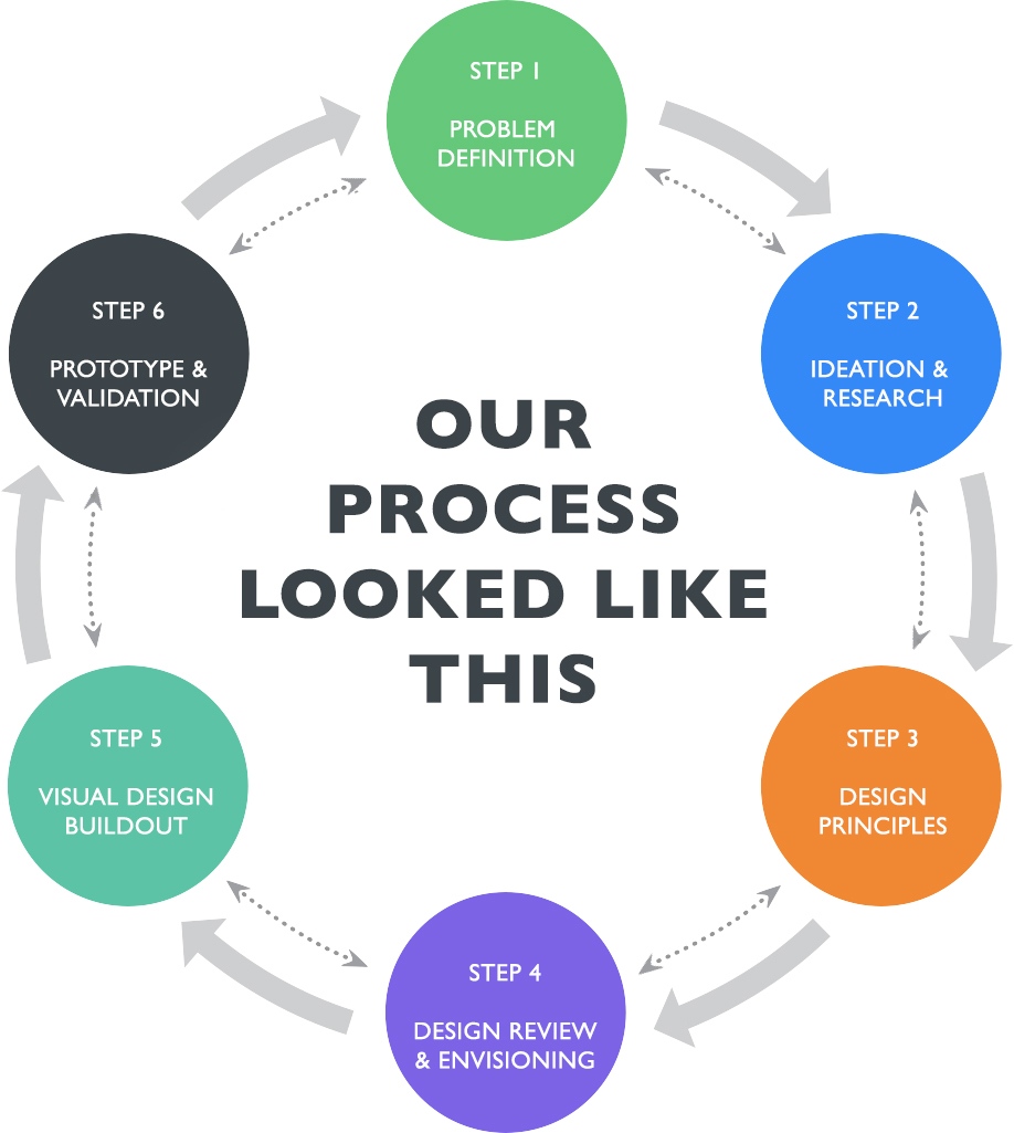
TWO
Ideation & data collection
BASICSWho is the user?
User 1: Photo editors and media professionals
User 2: Shutterstock Content Team selling content
What are their goals?
User 1: Buy content - this includes discovery, sharing, and purchasing.
User 2: Sell content to User 1 - this includes listing assets for sale as well as publishing supplemental content to create a rich browsing environment.
Research
I lead qual research with the assistance of a researcher who focused on quant servers. Together, we focused on user group 1 (our customers).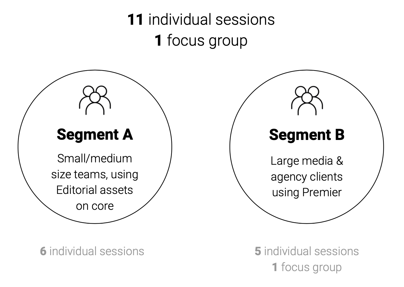
I first sought to understand the basics
of their team workflow
Background— How are Editorial teams structured? How large are they?
— How is their project workflow setup?
— Do they have a clear understanding of Editorial licenses?
Workflow
— What is their selection process, from a UX perspective?
— What is the approval or review workflow like?
— What is their purchase and/or download workflow like?
Problems
— What problems are they facing with our current sites?
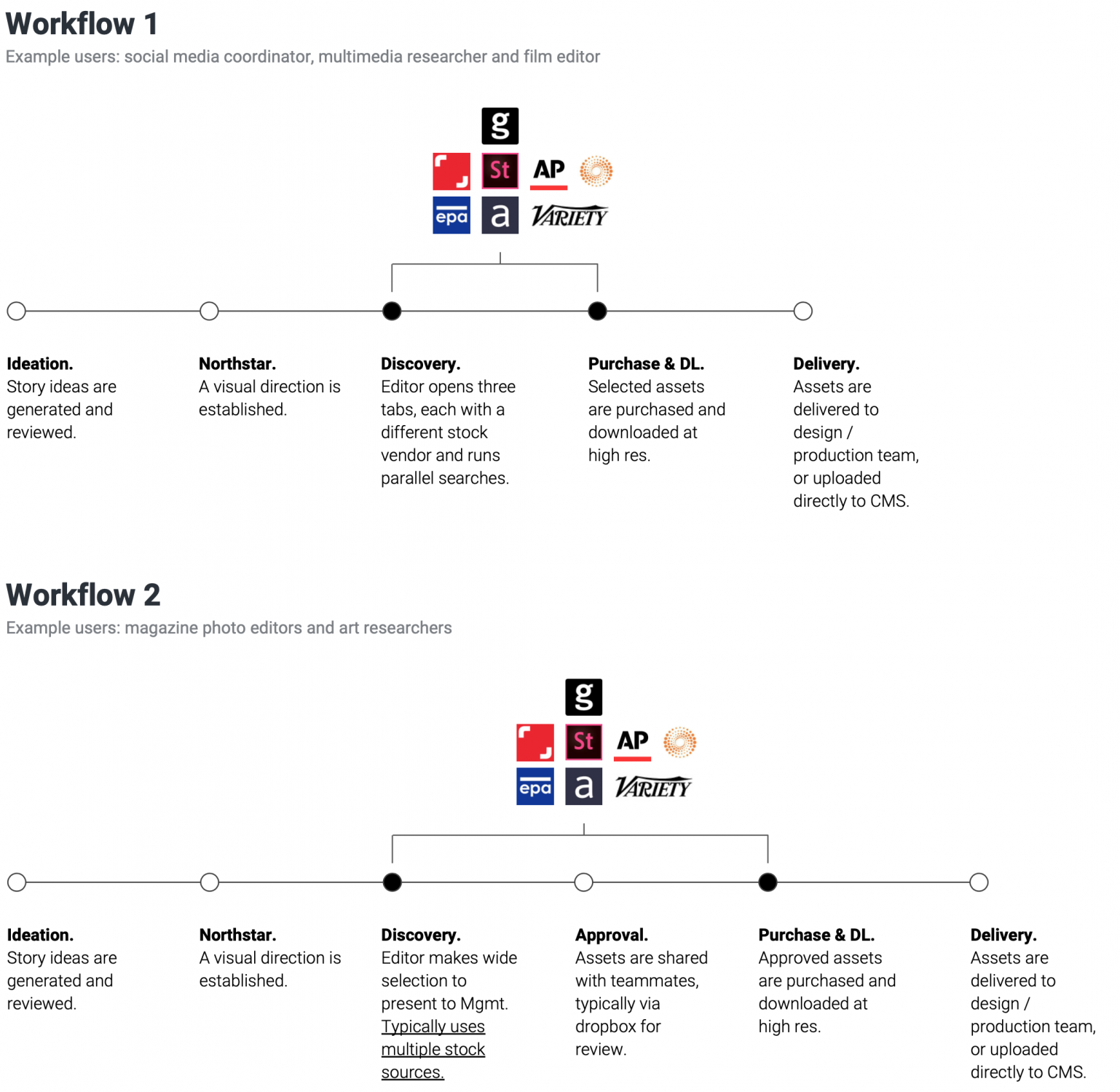
I distilled our findings into
two distinct workflows
We then evangelized what we had learned
to other Shutterstock teams
I gave presentations to the Editorial Sales teams (100+ team members) and created a screencast to share ideas with the Search & Discovery team (below). We also spoke at monthly Product Gatherings and Town Hall events to share our learnings and spread awareness of our new ideas and the forthcoming Editorial Product.• Our team aimed to push new ideas that expanded Shutterstocks product boundaries.
• Our team launched long term data initiatives, such as an "entities database" - to create one "source of truth" for metadata on celebrities and public figures.
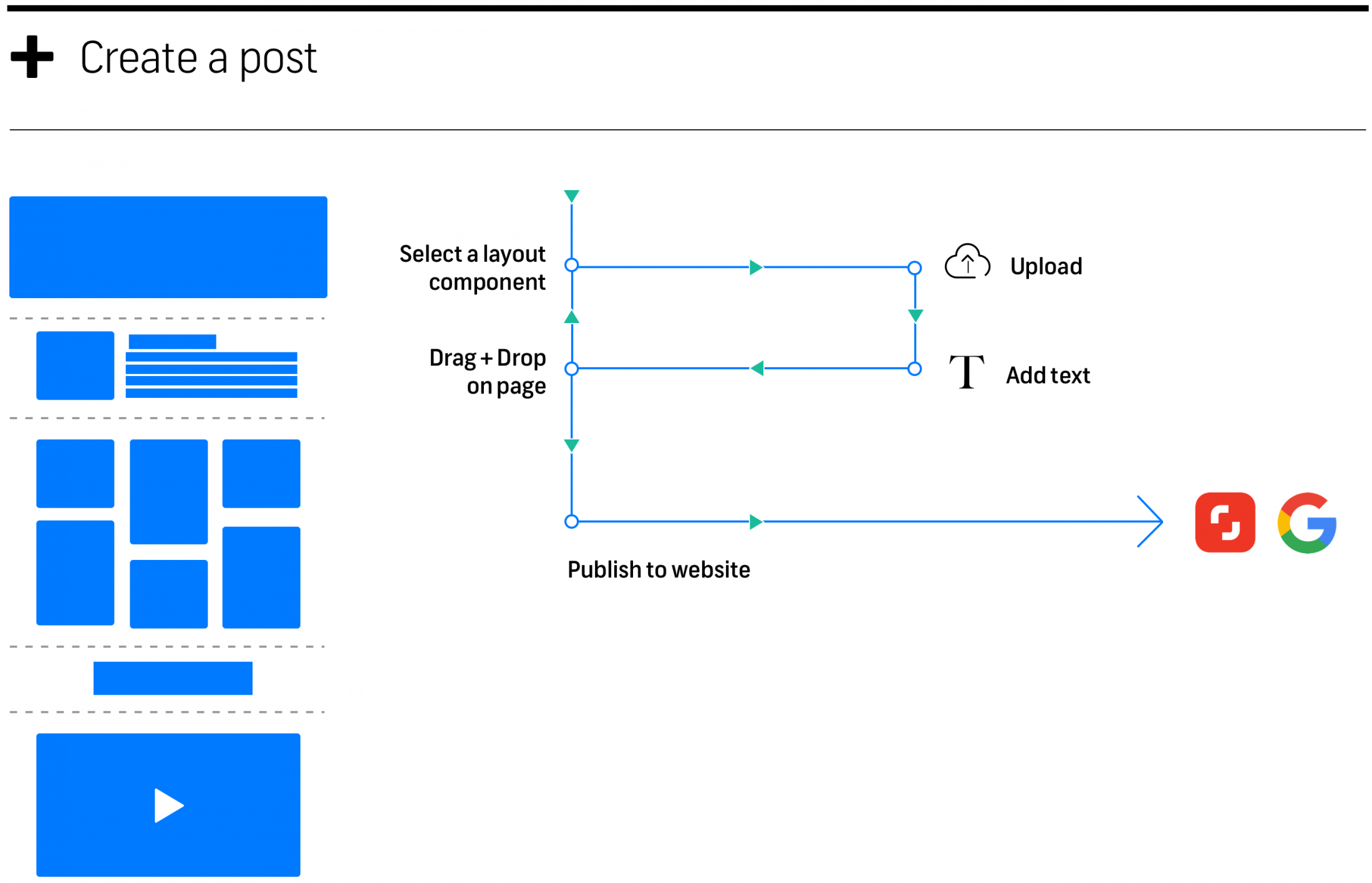
I also mapped the Shutterstock
Content Team's workflow
Using an API for a Headless CMS, we developed a system for Shutterstock's Content Team to create articles and publish content to the Editorial Site. Much of my work was focused here, having had the experience of developing a Website Builder and Blogging platform on Visura.co, this work was a natural fit for me.
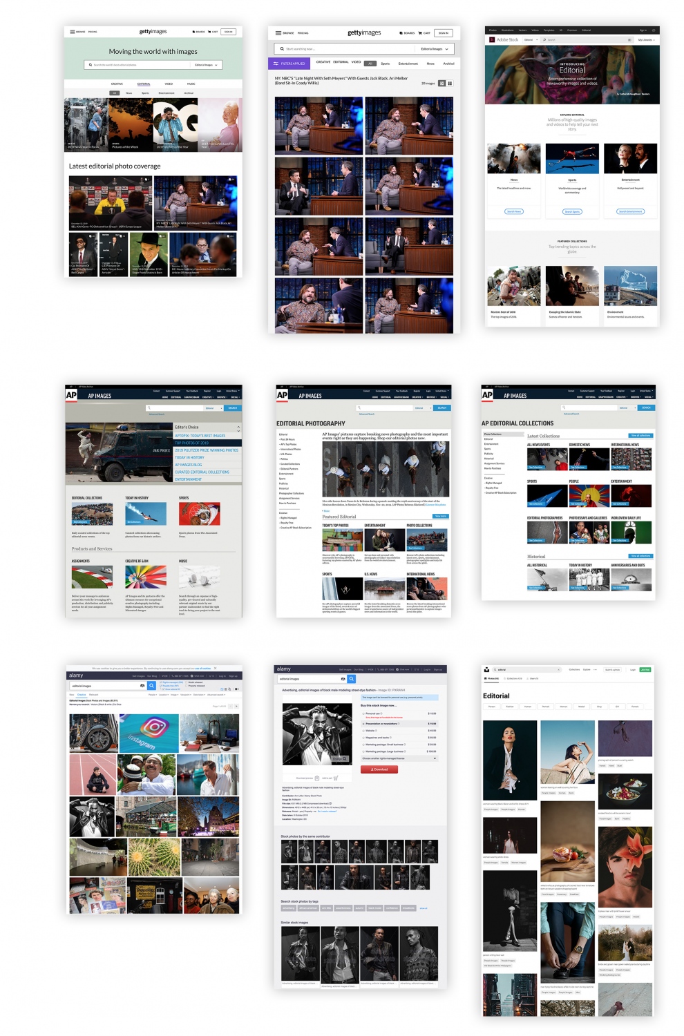
We studied our
competition carefully
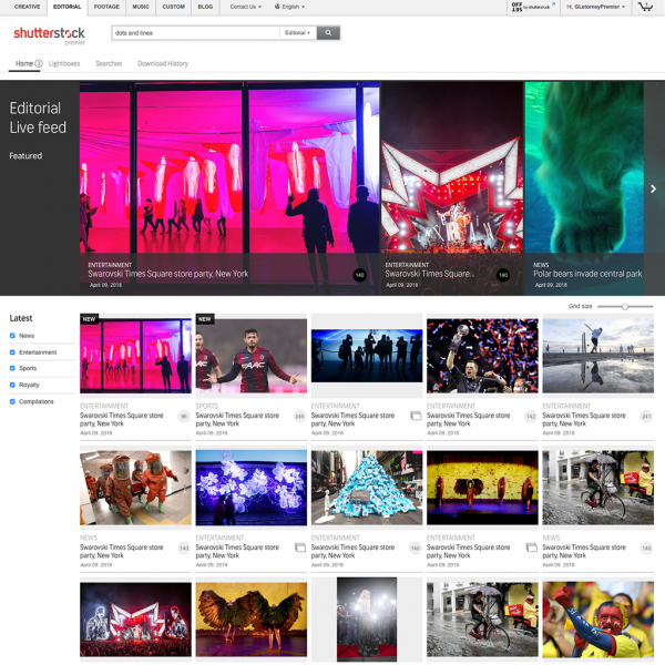
THREE
Design Principles
There is a glow that I always get after qual research. After spending weeks talking with users, their passion and excitement sort of just rubs off. I find this is the best time to develop the project's design principles. After discussing with the other designers on my team, I settled on:
1. Narrative — We would merchandise news content with context and layout, as if it was being published.
2. Informative — We would supply supplemental information. If a user wasn't specifically searching for an image or topic, they wanted to browse and be inspired.
3. Elegant — We would present ourselves in an elegant manner, befitting of Editorial design. Editors and media professionals should feel at home and feel inspired to buy and publish our content.
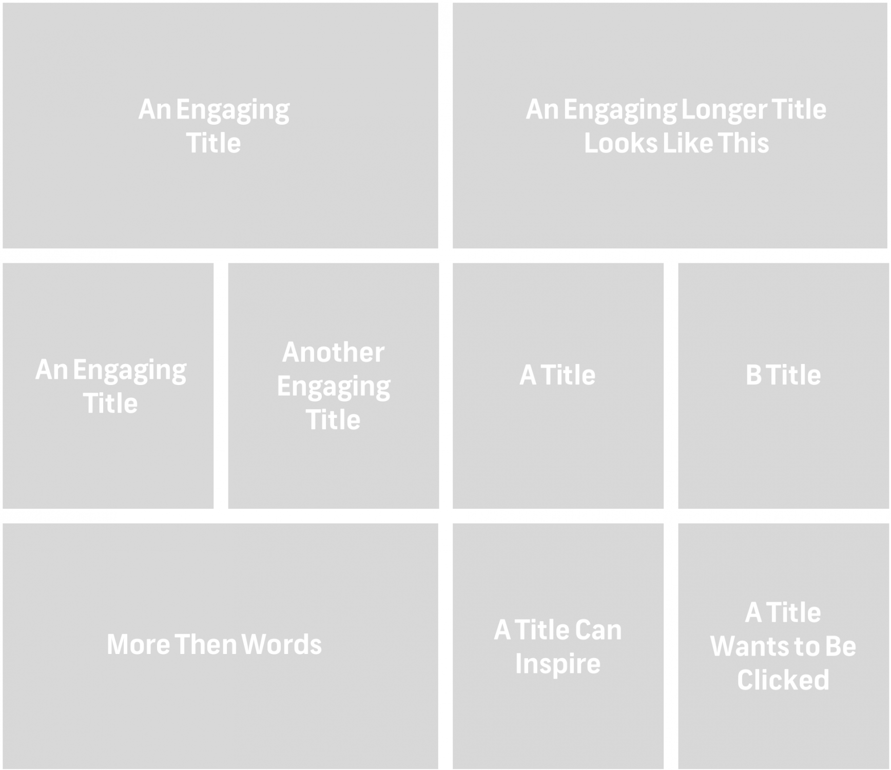
Wireframing
& component review
To start the design process I began by thinking abstractly, in broad concepts. Design systems: At that time, Shutterstock was developing "Studio" its new Design System (I was a senior contributor on the project and coded the internal documentation website). I was asked to start thinking ahead. I used and contribute to the new DS before it was complete.
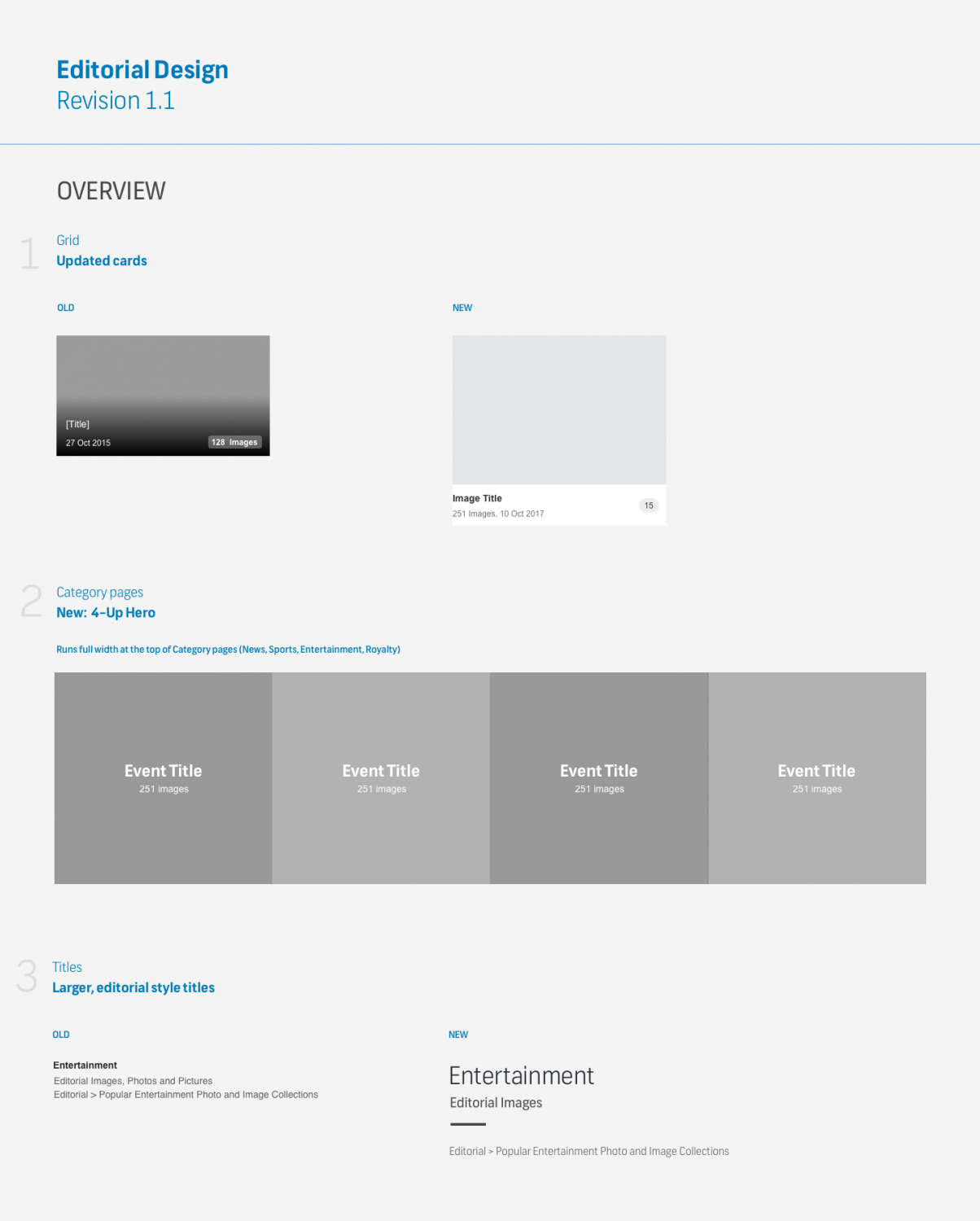
We proposed an asymmetrical
grid layout, commonly used in Editorial
FOUR
Design Critique
While I was at Shutterstock I helped rethink how we utilized Design Critiques. I believe we created a strong culture for supportive and challenging critiques that focused on creating a "Creative brain trust" — a group of advisors who were passionate about, but not directly responsible for the execution of the design work. The setup: Every Friday afternoon the UX Team (15 designers in 4 offices) would gather for 1 hour to discuss three projects. The atmosphere is supportive and challenging. We also focused on:
1. Hypothesis: What problems are you trying to solve?
2. Solutioning: How well have you executed your hypothesis?
Design revisions
The Editorial Product was given two weeks of critique. The conversation was focused on 1) the merits of our publishing environment — how effectively could Shutterstock Content Team merchandise breaking news and compelling narratives; and 2) how well did we utilize the new Studio Design System.Outcomes:
• I identified component improvements within Studio specifically for Editorial.
• I identified a need for new components to be added to our internal CMS.
NOTE: THIS LED TO A PROMOTION. I was promoted to UX Lead of the Growth Team which was focused on developing our internal publishing CMS for all top of the funnel pages, including the Shutterstock.com homepage. During this time I maintained my role as the Senior Product Designer on Editorial.
FIVE
Visual Design
After organizing and vetting the feedback I received from the Design Critique, I organized a gathering of our immediate team (PM, SDM, Visual Designer) and shared the feedback. I then asked them to each share their thoughts. As a team, we talked about positive takeaways from the critique and discussed new perspectives which were introduced.
The experience here was very positive and serviced to move the project forward into a considerably more refined state.

BACK TO STEP FOUR
Design Critique
It had been 4 to 6 weeks since we had last shared our progress with the UX Team at Design Critique. I could sense our team was feeling good and that much had progressed. Not wanting to get out of sync with expectations and Design Leadership, we circled back for another round of Design Critique with our matured Visual Designs.We listened.
We learned.
We made a few key updates.
SIX
Prototyping & User testing
Nearly 8 months had passed since our Project Kickoff and we were finally ready to Prototype our designs and get them in front of real users. Prototypes
Note: Due to Shutterstock's policy on intellectual property, I am not able to share our working prototypes.
I coded HTML / JS prototypes for the Search Assistant and Editorial Search Results Grid. I circled back to 3 users I had interviewed in our Qual research as well as tested with Shutterstock employees.
User testing
Each of the prototypes I tested resulted in product improvements. Some marginal, some were more significant. I am personally a big advocate of getting 'rough' tests in front of users early and often — I find these lead to the most valuable lessons we can learn.
Launch with a Hypothesis and be ready to iterate.
An important part of any product launch is having clear expectations. This starts with a UX hypothesis and a defined profile of UX metrics to evaluate.
UX Hypothesis
By creating an elegant Editorial reading environment and a curated set of topics our customers will be more likely to spend time on the site, be more engaged with the content, and therefore more likely to purchase.
UX Metrics:
• Session duration
• Pages per session
• Return visits per month
Production Designs
Technical constraints
During the final stages of the design process, our Product team determined that the Editorial search and discovery pages would remain on a frontend stack which rendered 1.0 Design Patterns and in parallel, our CMS for deploying Landing Pages would be transitioned to a new stack which rendered our 2.0 Design System.
During the final stages of the design process, our Product team determined that the Editorial search and discovery pages would remain on a frontend stack which rendered 1.0 Design Patterns and in parallel, our CMS for deploying Landing Pages would be transitioned to a new stack which rendered our 2.0 Design System.
2.0 Design system


1.0 Design system


A Hackathon win
We had a chance to develop some of our more experimental ideas at the Shutterstock Hack to the Future Hackathon. And guess what, we won! That's me on the right. We developed and prototyped a search filter that graphed asset volume over time.Search results such as "The Oscars" will show large spikes once per year around the time of the event. Users could then 'scrub' over the graph to narrow the range of search results to a specific timeframe.

Business Results
[For reasons of non-disclosure I can not share specific stats or actual data]Weekly Business Intelligence meetings
Following the launch of our Shutterstock Editorial we organized weekly check-ins with our BI unit to follow a concise profile of stats.
We tracked:
• Revenue
• Session duration
• Pages per session
• Return visits per month
The UX Design team measured:
• HEART Framework
• 30 days post-launch Quant survey
Wins
First and foremost the new Shutterstock Editorial product saw strong user engagement and consistent sales growth > 12% month of month for the proceeding 18 months.
We continued to work with Shutterstock Content Team and further buildout a suite of publishing tools. This included a set of UI Components for our headless CMS product.
Challenges
Due to technical challenges, we were not able to launch all of our designs on our new Design System — many of the visual design presented above had to be translated back into our old design system. We matched patterns using our old UI Kit.
Team takeaways
As with most product launches, we learned many lessons. I am super proud of our team, we all started as new to Shutterstock and quickly established itself within the larger product organization.
Many of us, myself included, went on to drive larger projects for the company.