LESSON #711
Vmail messenger,
UI Refresh
—

Let's clean it up.
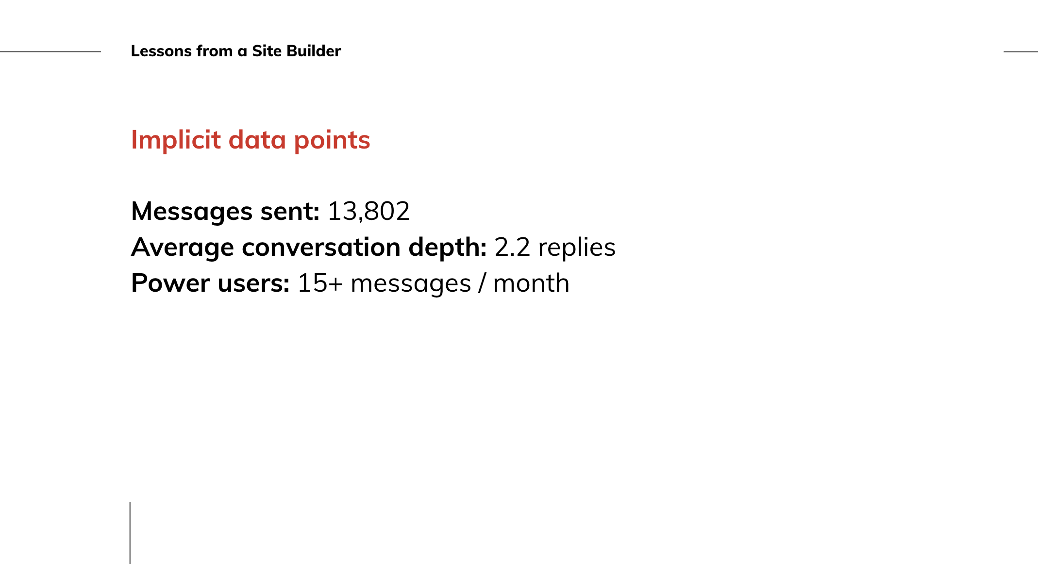
The situation: 8 months after launching our on-platform messenger, affectionately dubbed ‘vmail’ - we need to refactor the user interface.As usage picked up, we sought feedback.
We sought
simple feedback.
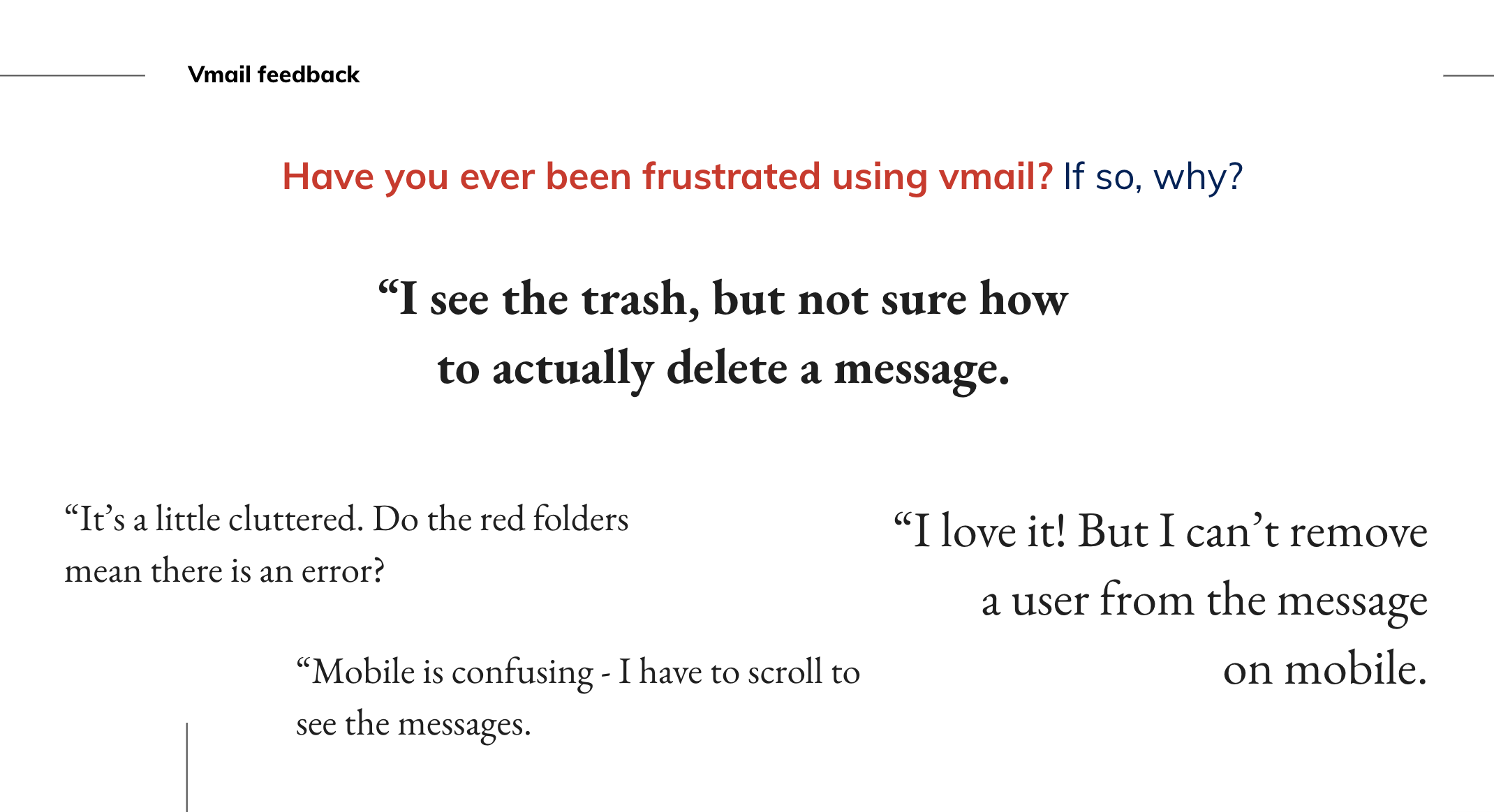
We asked 3 simple questions:
1. On a scale from 1 to 5 (1 being hard, 5 being very easy), how do you rate your experience sending and receiving messages?
2. Have you ever been frustrated using vmail? If so, why?
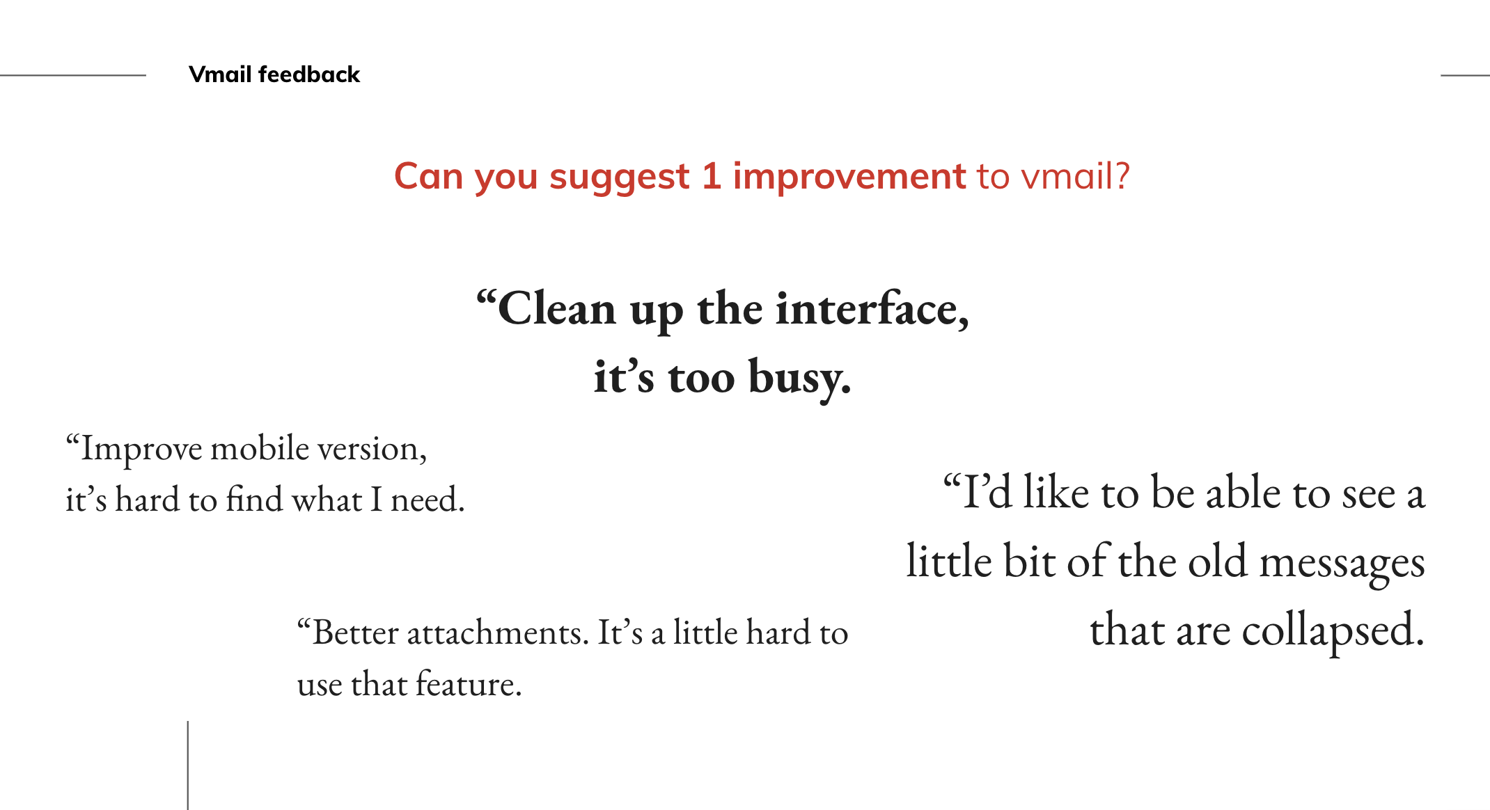
3. Can you suggest 1 improvement to vmail?

Brand red was
the wrong choice.
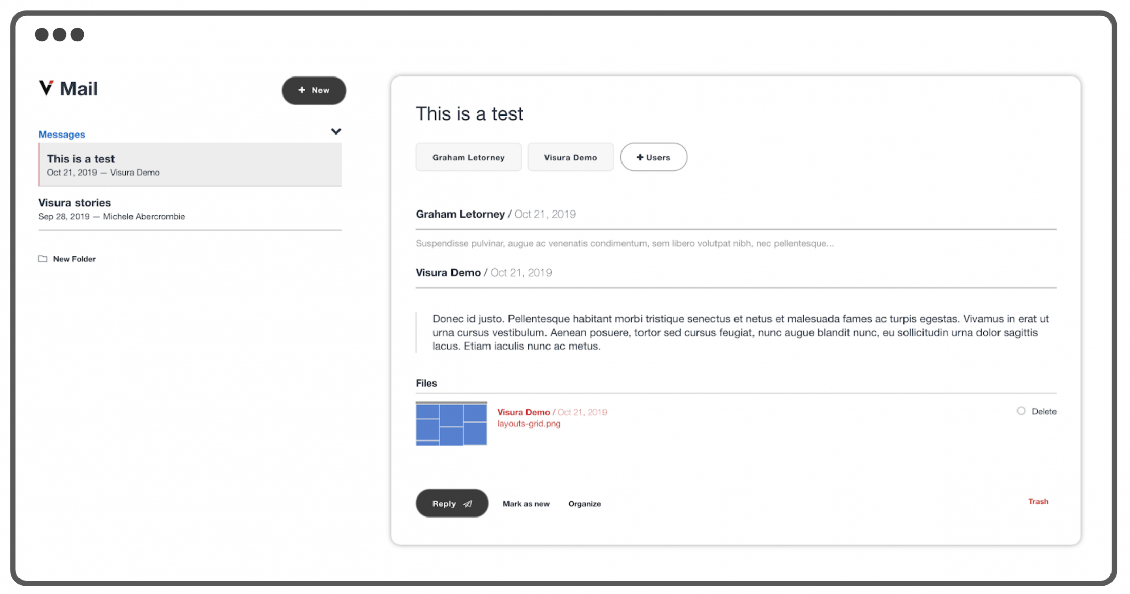
The original desktop sidebar featured brand red call-outs.
We believe this was driving feedback regarding “Errors or warnings” in the folders.

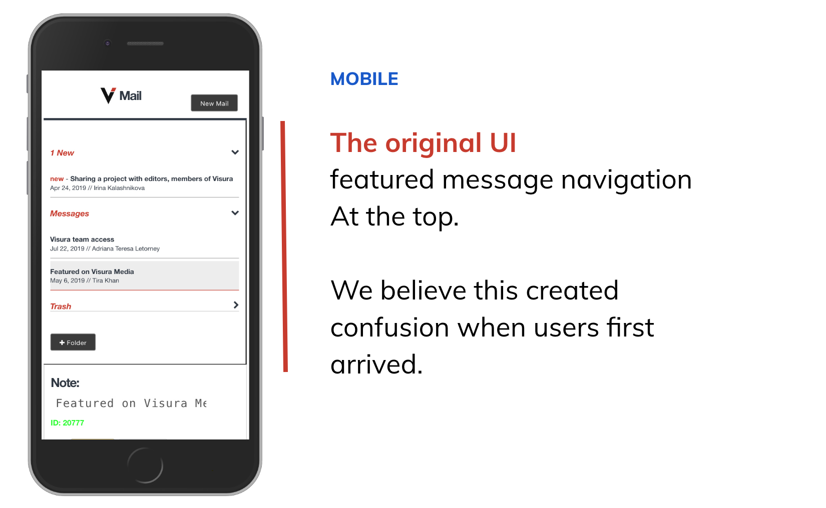
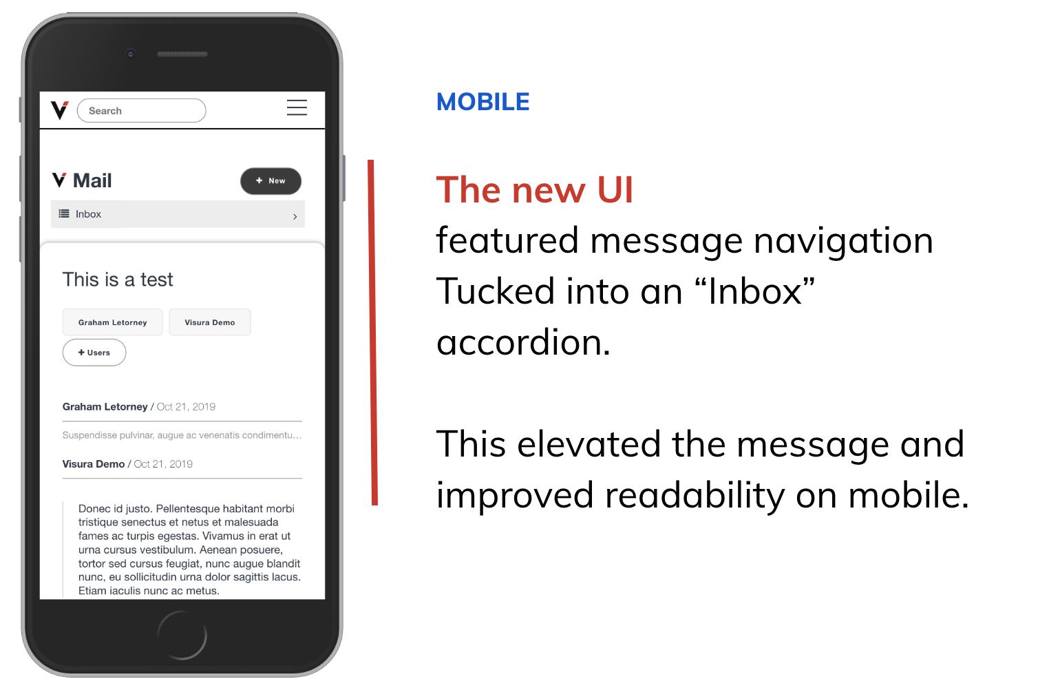
The new UI
corrected for this.
- • Blue call-outs
- • More compact
- • Visually lighter

We identified more
UI troublemakers.
- • Confusing links
• Font too light - • Inconsistent typography

Improvements
- • More visual weight on message text
- • Added preview text on previous messages
- • Clear toolbar at the bottom of the message.
- • Added preview of attached files

Takeaways

The new
Vmail UI